
Choose Impactful Brand Colors for Solo Consultants
Your color palette isn’t just about looking pretty – it communicates your brand’s personality and values at a glance.
For a new consultant venturing out alone, picking colors may feel daunting. But don’t worry, you don’t need an art degree or a big agency budget. In this guide, we’ll walk you through every step of selecting impactful brand colors that resonate with your target clients. We’ll also show how to tap into AI color generator tools to make the process easier (and more fun!). By the end, you’ll know how to craft a palette that feels authentic, appeals to clients, and differentiates your consulting brand.
Whether you’re in the U.S., Canada, UK, or Australia, the principles are the same. We’ll cover a bit of color psychology (ever wonder why so many consultants use blue?), step-by-step instructions, AI prompt examples to generate palettes, and even some community tips from Reddit and Quora. Grab a cup of coffee, and let’s add some color to your brand!
Step-By-Step: Choosing Your Brand Colors as a Solo Consultant
Picking brand colors can be broken down into manageable steps. Follow this roadmap to go from blank slate to a polished color palette:
Define Your Brand Identity – Start with who you are and what you stand for. Are you a tech-savvy consultant who’s innovative and bold, or a career coach who’s calming and supportive? Jot down a few keywords for your brand’s personality and values (e.g., innovative, trustworthy, friendly). This clarity will guide all your color decisions. A strong brand identity acts as a filter – you’ll choose colors that match the vibe you want clients to feel.
Understand Your Target Audience – Think about your ideal clients and what might appeal to them. If you target corporate clients or executives, a sleek and professional color like navy blue or gray might set the right tone. For creative entrepreneurs or startups, you might inject a pop of energetic color like orange or purple. Consider age, industry, and culture of your audience. For example, younger tech founders might appreciate modern, vibrant palettes, while a more traditional audience might respond better to classic, subdued tones third-angle.com.
Learn Basic Color Psychology – Colors evoke emotions and carry meaning. Even if you’re new to design, a quick color psychology primer will help you choose wisely. Here are a few common colors and what they often represent in consulting and professional services:
- Blue – Conveys professionalism, calm, and trust.
- Green – Suggests growth, balance, and harmony.
- Purple – Implies creativity, wisdom, and a touch of luxury.
- Orange – Radiates enthusiasm, ambition, and energy.
- Yellow – Signals optimism and positivity.
- Black/Gray – Communicates sophistication, authority, and simplicity.
- Pink – Evokes warmth and compassion.
Why does this matter? Using color psychology ensures your palette reinforces the message you want to send. For example, blue and green are popular in consulting for a reason – blue has a calming effect and signals trust, and green implies reliability and growth canva.com. Meanwhile, a combo like yellow and black shouts for attention (think caution sign), which might not suit a gentle consulting brand quora.com. Choose one primary color that aligns with your brand’s core trait and a couple of supporting colors that complement that emotion.Research Industry Norms (and Defy Them Wisely) – Look at other consultants or small firms in your niche. Do they mostly use cool colors like blue, teal, and gray? Or warm tones like red and orange? This research gives you context. For instance, professional services and consulting firms often favor blues and grays – dark blue in particular conveys security and trustworthiness third-angle.com. Using a similar trusted color can instantly signal “I’m a professional” to clients. However, you also want to stand out. If every competitor is blue/gray, you might introduce a distinct accent color (say, a dash of orange or green) to be memorable. The key is to balance familiarity with a twist of you.
Pick a Dominant Color – Choose one main color that will be your brand’s signature hue in logos, website headers, and key materials. This should be the color that best represents your brand’s personality (from Step 1) and appeals to your audience (Step 2). For example, if you decided your vibe is trustworthy and calm, a shade of blue or teal might be your dominant color. If it’s modern and energetic, maybe a vibrant orange. Tip: If you already have a logo or a design you like, you can pull a dominant color from there. You can also use tools like Adobe Color or Coolors to experiment – start with a hue you love and generate related shades. (In a moment, we’ll show how AI tools can help generate palettes from just a text prompt!).
Choose 2-3 Complementary Colors – With a primary color set, add a few supporting colors to round out your palette. These can be neutral tones and an accent. A common formula is the 60-30-10 rule in design: 60% dominant color, 30% secondary color, 10% accent treasurewebdesigns.com. For instance, if navy blue is your 60%, you might choose a gray or white (neutral) for 30%, and a pop of light blue or orange for the 10%. Ensure the colors work well together and match the tone you want. How to pick companions? Use a color wheel: complementary colors (opposites on the wheel) give a high-contrast, energetic look, while analogous colors (neighbors on the wheel) create a harmonious, calming palette. For example, if your main color is blue, a complementary scheme might add orange as an accent (for energy), whereas an analogous scheme might add green and teal for a serene feel. Play with a few combos. If design isn’t your forte, this is where AI color palette generators or even Canva’s built-in palette tool can suggest nice combinations.
Test for Contrast & Readability – Before you lock in your choices, make sure your text will be readable and your designs accessible. Contrast is crucial, especially for things like website text vs. background treasurewebdesigns.com. Put your colors to the test: for example, if you have a light color like pastel green and plan to use it for text on a white background, that might fail contrast standards (hard to read). Tools like the WebAIM Contrast Checker can help. Also consider visually impaired users – ensure no essential info is conveyed by color alone. High contrast isn’t just a nerdy detail; it affects how professional and polished your brand looks to everyone.
Get Feedback and Refine – It’s easy to get attached to the colors you pick, so get a second opinion. Share your draft palette with a friend or fellow consultant. Even better, ask in a community of small business owners or designers (there are great subreddits like r/branding or r/smallbusiness). They might point out if the colors clash or if the vibe doesn’t match your intended message. For example, one Reddit entrepreneur emphasized using “colors that inspire comfort” for businesses where trust is key – noting that sky blue immediately puts people at ease reddit.com. Insight like that can validate your choices or inspire tweaks (maybe that bold red you chose is more alarming than exciting). Refine your palette if needed.
Apply Your Colors Consistently – Once you’re happy with your palette, commit to it. Update your logo (if needed), your website, social media banners, business cards – everywhere. Consistency will build brand recognition treasurewebdesigns.com. A handy trick: save the HEX codes of your colors in a file or use a brand kit tool (like Canva’s Brand Kit) to keep them on hand. That way, every time you create something (or use Pineapple Builder’s website generator), you input the same codes for a unified look.
By following these steps, you’ll have a cohesive set of brand colors that tell your story. It’s a mix of introspection (what feels right for you), psychology (what feels right for them, i.e., your clients), and a bit of creative experimentation. Next, let’s dive deeper into how you can harness AI tools to speed up this process – because why not have a digital assistant help brainstorm your perfect palette?
Using AI Tools to Generate Your Brand Color Palette
Picking colors is part science, part art – and now, part artificial intelligence! If you’re feeling stuck or just curious, AI color generators can suggest beautiful palettes based on simple inputs. As a solo consultant, you might not have a design team, but with AI you kind of do. Here’s how to leverage these tools:
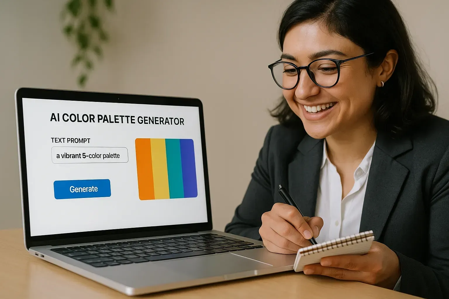
Brainstorm with ChatGPT or AI Assistants: You can literally ask an AI, “What colors might work for my brand?” and get instant ideas. For example, Pineapple Builder’s AI Assistant can generate brand color palettes tailored to your business description – it’s like having a branding expert on call. (In fact, Pineapple’s AI Designer acts as a personal design assistant, suggesting color palettes that fit your style fahimai.com.) You can also use general AI chat tools. Simply describe your business and vibe, and ask for color suggestions.
Try these prompt examples with your AI color generator:
I run a boutique consulting business helping nonprofits. My brand values are trust, integrity, and hope. Suggest a 3-color palette (with HEX codes) that would appeal to my clients.
Generate five distinct color scheme options for a freelance marketing consultant targeting creative startups. Include a short note on the feeling each palette conveys.
My consulting company focuses on innovation and tech. I want a modern, bold look. What primary and secondary brand colors should I consider, and why?
What to expect? The AI might propose something like blue and orange for the innovation consultant (blue for trust, orange for creativity) or teal and gray for the nonprofit consultant (teal for stability with a modern twist, gray for neutrality). It often explains reasoning, which helps you learn and decide. Don’t hesitate to iterate – if the suggestions feel off, clarify your prompt (e.g., “more vibrant,” “less feminine,” “include a neutral tone”). The AI will refine the palette.
Use Dedicated AI Color Palette Generators: There are tools specifically built for this. For instance, ColorMagic, Khroma, or Adobe’s AI-powered palette generator let you enter keywords or themes to produce color combos treasurewebdesigns.com reddit.com. One designer on Reddit noted how typing a simple prompt like “sunset vibes” or “calm forest” into an AI palette tool instantly generates a full beautiful color palette reddit.com. Imagine what business coaching vibes or modern consultant might generate! These tools can be great for inspiration – you might see a combo you love that you hadn’t considered. If you have a specific image or logo, some AI tools also allow you to upload it and they’ll pull a palette from it automatically.
Community and Human + AI Mix: A clever approach is to combine AI suggestions with community advice. For example, you could ask an AI for palettes, then post the top 2-3 options in a forum or LinkedIn poll for feedback (“Which palette feels more trustworthy for a consulting business?”). This way, you get creative AI ideas plus real-world votes. One Quora discussion on consulting brand colors pointed out that blue is broadly seen as corporate and stable, green signals growth or eco-friendliness, while a black/red combo can come off as bold and aggressive third-angle.com quora.com. With that wisdom, you might use AI to find a shade of blue or green that’s unique to you (like maybe a teal or emerald, which the AI could suggest as a twist on standard blue).
Speed Up the Website Mockup: After you have some color ideas, you can even preview how they look on a website or logo. Pineapple Builder, for example, can instantly apply your chosen colors to a website design – so you can see a live preview of a site with, say, that navy and orange scheme. It’s one thing to see color swatches, but another to experience them on an actual webpage or business card. AI can generate quick mockups for you. This helps answer “Will these colors actually work together in real life?” before you fully commit.

Using AI is like having an assistant who works 24/7 on design ideas. It doesn’t replace your judgment – you’ll always tweak and choose what feels right – but it can accelerate the creative process. Plus, it’s actually pretty fun to see what an algorithm thinks your “professional yet friendly consulting brand” should look like in color! By combining your personal insight with AI’s speed and breadth of suggestions, you truly get the best of both worlds.
Examples: Brand Color Palettes Tailored to Solo Consultants
To make all this advice concrete, let’s look at a couple of real-world inspired examples. These scenarios show how a new consultant might go from their business description to final brand colors:
Example 1: The Trusty Financial Consultant
Meet Alex, an independent financial consultant in the U.S. who helps small businesses with accounting and planning. Alex’s keywords are trustworthy, expert, and calm. Clients are often anxious about money, so Alex wants to appear solid and reassuring. After following the steps, Alex chooses a dominant navy blue (professional and stable) third-angle.com. For complementary colors, Alex adds soft gray (neutral, clean) and a touch of green as an accent. Why green? It nods to growth and money (without screaming it), and adds a fresh balance to the palette. The result is a classic, credible scheme: Navy Blue, Gray, and Sage Green. On Alex’s website, the header is navy, the text is charcoal gray on white (great contrast), and buttons or highlights use the gentle green. This palette tells visitors “you can trust me with your business.”


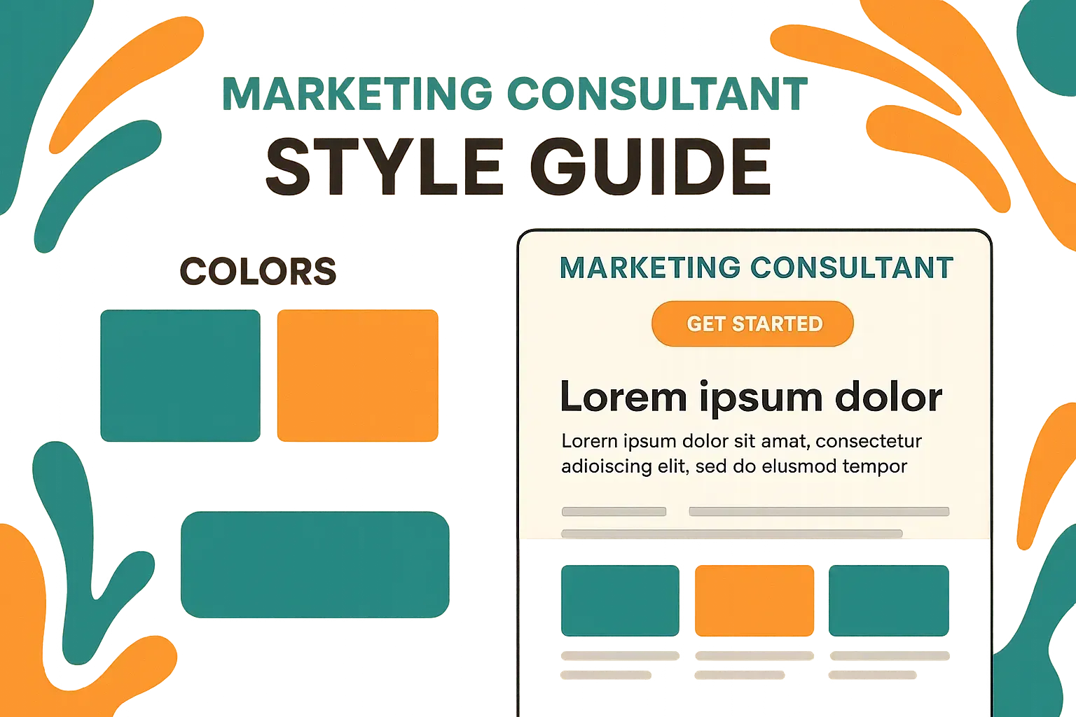
Example 2: The Innovative Marketing Coach
Meet Bri, a marketing consultant in Canada who works with creative startups. Bri’s brand personality is innovative, energetic, and modern. To stand out in a crowded market, Bri is open to bold colors. After brainstorming with an AI generator, Bri fell in love with a teal and orange combo. Teal (blue-green) carries the trust of blue with the growth vibe of green – perfect for innovation – and it’s less common, so it feels fresh. Orange adds energy and friendliness (and happens to really pop against teal, being near complementary on the color wheel). Bri uses dark teal as the dominant color, a vibrant orange accent, and balances it with white and charcoal for text. The AI even suggested a secondary light blue that pairs well, but Bri decided to stick to two brights plus neutrals to keep it simple. On business cards and her website, this palette is striking: a teal background with white text is readable and sleek, and an orange call-to-action button draws the eye. This scheme says “creative and confident” the minute someone sees it.

Example 3: The Compassionate Career Coach
Meet Dana, a career coaching consultant in the UK just starting out. Dana’s clients are mid-career professionals looking for meaningful changes, often feeling stressed. Dana’s approach is very supportive and positive. For brand colors, Dana chooses a soft palette: a calming blue-green teal as the primary color, complemented by warm beige or ivory (for an approachable, friendly touch), and a soft gold accent (to signify optimism and success). This trio creates a soothing yet uplifting feel. It’s more muted than the previous examples – which fits Dana’s gentle style. After testing, Dana ensures the teal text on a white background passes contrast checks (it does, being a darker teal) and uses the gold sparingly to highlight call-to-action buttons or important info. The overall impression: warm, encouraging, and trustworthy – exactly how Dana wants clients to feel.
These examples show how different consulting niches can have very different palettes, each effective for their purpose. The key was aligning colors with the brand mission and client expectations, and using a bit of strategy (and AI suggestions) to mix and match hues.
Conclusion & Next Steps: Bring Your Brand to Life 💡
By now, you’ve learned how to go from blank canvas to a set of colors that speak for your business. You’ve considered your brand identity, your audience, the psychology of colors, and even played with AI-driven ideas. The only thing left is to put it into action.
Why not take your new palette for a spin? A great next step is to build a simple one-page website or a social media profile banner with your colors. This is where Pineapple Builder’s AI Assistant can be a lifesaver for solo consultants. Pineapple Builder not only helps you generate a color palette; it can use those colors to create a polished website in minutes – no coding or design skills needed. In fact, its AI can generate entire website sections, suggest layouts and apply your brand colors automatically fahimai.com. It’s like having a designer implement your vision instantly.
Try it out: Head over to PineappleBuilder.com and try the AI brand color generator. You can input a prompt like “I’m a career coach who values positivity and trust; generate a website color scheme and design style”_into Pineapple Builder’s AI Assistant. You’ll get a tailored palette (and even a website preview) that matches your description. The AI might give you, say, a blue and yellow combo with a friendly layout – you can then tweak it or ask for alternatives. Within a few minutes, you could have both your brand colors _and a starter website, ready to go live!
Remember, choosing brand colors is an iterative, creative process. Don’t be afraid to adjust as your business grows or if you find a color just isn’t resonating with clients. The beauty of being a solo consultant is agility – you can refine your branding anytime. With tools like AI on your side, you have an edge to create a brand that looks like a million bucks (without spending a fortune or weeks of time).
Now it’s your turn: put these tips into practice and create a color palette that truly represents you and attracts your ideal clients. Give Pineapple Builder’s AI color generator a try to jumpstart the process, and watch how quickly your brand comes to life in full color. Good luck, and happy branding!


Ready to elevate your consulting brand with the perfect colors?
🚀 Try PineappleBuilder.com’s AI Assistant to generate your custom brand color palette and preview your website design today. Your future clients will remember you – and your colors – from the very first impression!
