Header menu
Help visitors move around your website with a title, logo, page links and optional action buttons.
Code name: Menu · Category: Navigation
Registered in the live renderer. Website context and the limitations below still apply.
When to use it
Use the shared header to make important pages easy to find. Keep labels short and reserve the main button for your most useful next step.
In the editor
- Open the header editor.
- Set the site title, logo and page links.
- Configure the action buttons and check the navigation on mobile.
Example
This example uses illustrative content. Media placeholders must be replaced with your own assets; data-backed blocks need the normal website context.
<Menu siteTitle="Your business" homeHref="/" ctaButtonShow={true} ctaButtonName="Get in touch" ctaButtonHref="/contact" />Behaviour and limitations
- The JSX name is Menu. Editing the shared header can affect multiple pages.
- Use ctaButtonName and ctaButtonHref for the main action. The second button has separate properties.
- Language-picker configuration is not proof that translated page content exists.
Property reference
Types below describe the editor controls and known choices, not every value accepted by the renderer. A renderer default is extracted from its parameter; an editor-only default does not prove the runtime default. “Not declared here” does not mean required. Preserve omitted values unless the requested edit needs them.
| Property | Editor value type | Default evidence | Guidance |
|---|---|---|---|
siteTitle | string | "Website title" (renderer) | Website Header Title. See the usage notes for this block. |
homeHref | string | "/" (renderer) | Icon link. See the usage notes for this block. |
customStyles | boolean | false (renderer) | Custom Styles. See the usage notes for this block. |
pages | See guidance | Not declared here | pages. See the usage notes for this block. |
backgroundColor | string | Not declared here | Background colour. Theme-derived appearance can still depend on the surrounding section. |
iconAlt | string | "" (renderer) | Image alt. See the usage notes for this block. |
iconDesktopHeight | number | 30 (renderer) | Icon Height (px). See the usage notes for this block. |
iconDesktopWidth | number | 30 (renderer) | Icon Width (px). See the usage notes for this block. |
iconDesktopSrc | string | "/defaults/logo-icon-example.svg" (renderer) | Icon src. See the usage notes for this block. |
minHeight | number | 64 (renderer) | Header height. See the usage notes for this block. |
isFixedPosition | boolean | false (renderer) | Overlay at top. See the usage notes for this block. |
headerBehavior | "scroll", "overlay", "sticky" | "scroll" (editor only) | Header behavior. See the usage notes for this block. |
ctaButtonShow | boolean | true (renderer) | Add "Call To Action" button. See the usage notes for this block. |
ctaButtonName | string | "BUY" (renderer) | CTA Button text. See the usage notes for this block. |
ctaButtonHref | string | "https://pineapplebuilder.com/pricing" (renderer) | CTA Button link. See the usage notes for this block. |
ctaButtonVariant | "primary", "secondary" | "secondary" (renderer) | Primary Button Variant. See the usage notes for this block. |
ctaButtonGoal | string | Not declared here | Analytics Goal Name. See the usage notes for this block. |
ctaTarget | See guidance | Not declared here | ctaTarget. See the usage notes for this block. |
isDarkMode | boolean | false (renderer) | Set white text. See the usage notes for this block. |
isDarkModeNestedMenu | boolean | false (renderer) | Dark theme for submenu. See the usage notes for this block. |
align | "left", "center", "right" | "right" (renderer) | Justify Menu Items. See the usage notes for this block. |
secondButtonShow | boolean | false (renderer) | Add Second Button. See the usage notes for this block. |
secondButtonName | string | "Learn More" (renderer) | Second Button Text. See the usage notes for this block. |
secondButtonHref | string | "https://pineapplebuilder.com/learn-more" (renderer) | Second Button Link. See the usage notes for this block. |
secondButtonGoal | string | Not declared here | Second Button Analytics Goal. See the usage notes for this block. |
secondButtonVariant | "primary", "secondary" | "primary" (renderer) | Second Button Variant. See the usage notes for this block. |
secondTarget | "", "_blank" | "" (renderer) | Second Button Target. See the usage notes for this block. |
showLanguagePicker | boolean | true (renderer) | Show language picker. See the usage notes for this block. |
Related blocks
Header Menu
The header is the top section of your website and appears on all subpages, and that’s exactly why it’s essential to have all the necessary information easily accessible for your customers. Let's take a look at the steps.
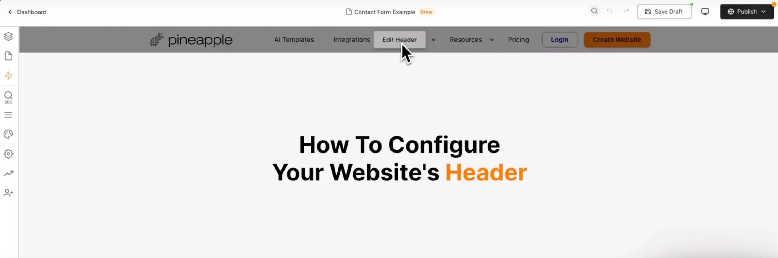
First, to edit the header, navigate to the Editor and hover over the header element. Then click Edit Header Component.

Website Title and Icon
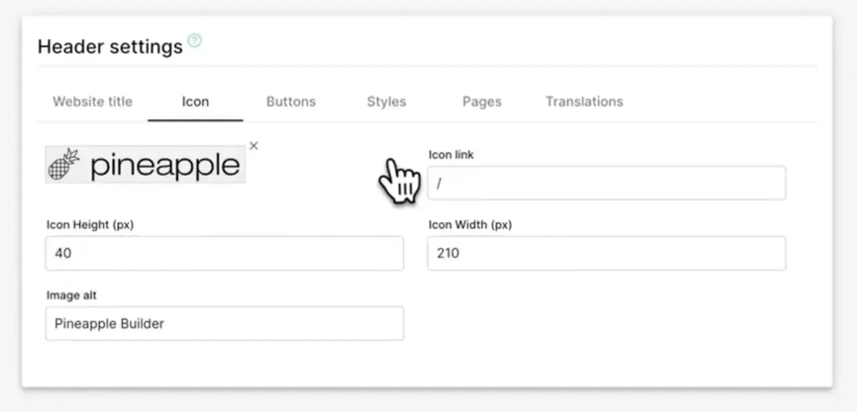
In the first tab, you can add your website title. For the icon, you can add your own or generate one using AI. Configure the height, width, and link for the icon. Typically, clicking the icon should navigate to your homepage (index page). Don’t forget to add an image alt text for better SEO.

Buttons
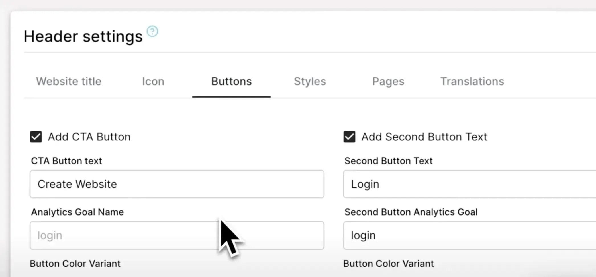
Next, you can add buttons to your header. You have the option to add one or two buttons, or remove them entirely. These buttons can be configured further. For instance, you could add a "Buy" button. To track clicks and conversions, add analytics tags as outlined in our Get Started documentation.

Color Variants and Links
Configure additional color variants for your header. Add links to either external websites or internal pages by selecting the desired page from your site. If you're unsure of the page name, you can copy the slug from the page URL and paste it here.
Styling and Positioning
Adjust the alignment, text colour, and background to match your site’s design. You can also fix the header’s position on the page to create a more distinct separation from the rest of the content. Custom styles and header sizes can be configured to suit your preferences.
Header List
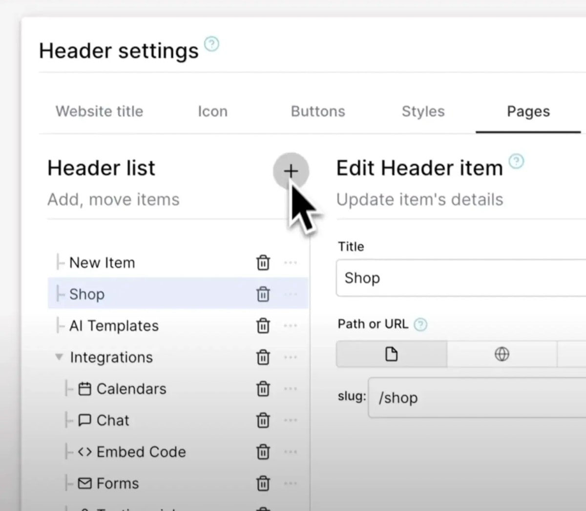
The header list includes the navigation items visible on your header. It’s simple to add new items, but keep in mind that space is limited. Aim for around four to five items to avoid overcrowding. You can nest items to create submenus, rearrange the order, and add icons or descriptions.
For example:
Shop: Link to your shop page.
Products: Nest under "Shop" and link to specific product categories.

Tips and Best Practices
Here are some tips to get the most out of your header configuration:
Be Specific: Ensure your title and button labels are clear and descriptive.
Experiment: Try different styles and configurations to see what looks best.
Stay Organized: Limit the number of header items to avoid clutter.