
1. What is a landing page and how is it different from a traditional web page?
You probably heard the term landing page and wondered how is it different from a classical web page. A landing page is a standalone page designed with one focus or goal – like joining a course, selling an ebook, or collecting emails. Your visitors "land" on the landing page when they click a link in an email, ad, or your social media. It usually doesn't have many subpages that would encourage them to discover different aspects of your topic, like traditional web pages. On the contrary, it rather promotes or informs the visitors about one particular aspect and invites them to engage with what's known as a call-to-action (or CTA).
Another term that usually appears when talking about landing pages is conversion. It means the moment a visitor takes an action on your website. Depending on your topic, the conversion can mean different things: making online sales, subscribing to a newsletter, or filling in a form.
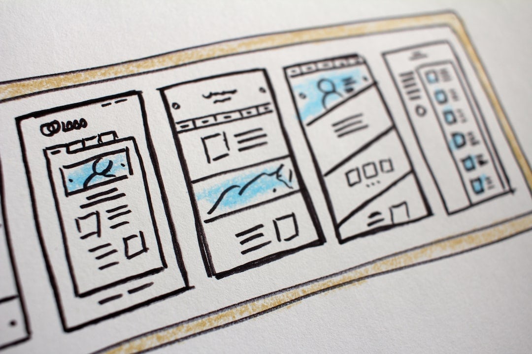
2. The structure of the landing page
The main goal of your landing page is to convert visitors into customers or users, so it needs an engaging and consistent narrative. You may say that it is easier said than done, especially when you do it for the first time. This is why we have put together some tips on how to construct a good landing page.
There are 5 key elements that every converting landing page should have. No worries if this seems like too much of an insider language, we'll go over them one by one:
A unique selling proposition (USP)
A great hero section
social proof
benefits
CTA
2.1 A great hero section
We all judge books by their covers and the hero section is just that. A great cover, placed at the top of your page captures your offer in an engaging way with a large image or video and a catchy message that presents your USP (unique selling proposition). Try to choose an image that shows what is best about your offer and place it in a context that conveys positive emotions.

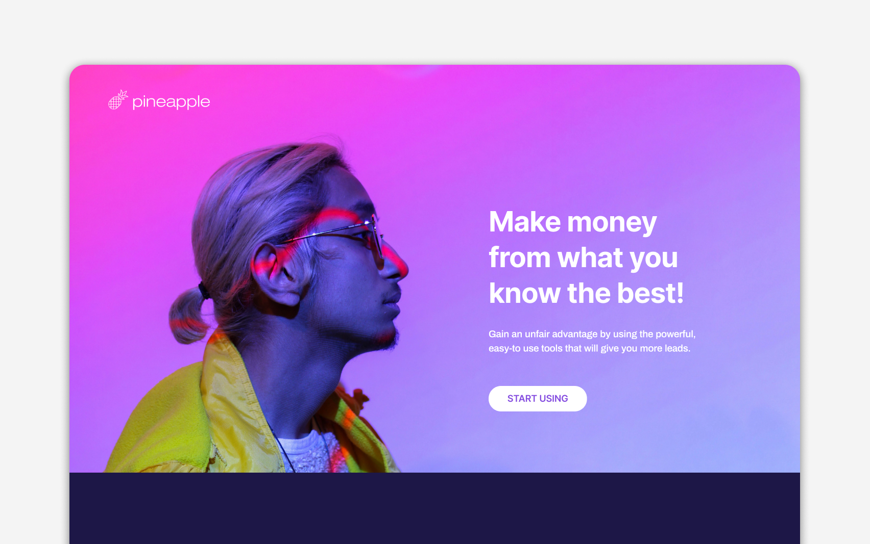
2.2 USP - Unique Selling Proposition
It is this powerful phrase that summarizes the key benefit of your offer. A hook that makes it stand out from the rest. When constructing your USP try to answer a question: "What makes my offer better or different than any other?"
USP needs to be concise, so your audience understands immediately, why your offer why is so special. Treat it like the title to the story that will follow when your visitors scroll through your website.
Present your USP in the headline text of your hero section. Write a catchy claim that will instantly speak to your audience. Use a subheadline to support your main message and give a bit of additional explanation.
It takes some skill to write a good headline, so try to think of some angles which you can take to make it stick:
talk directly to your user
inspire transformation, show how your offer can provoke a positive change
start with an action verb
talk about the outcome and present your offer as a solution
use comparison that people recognize
do not overcomplicate, use plain and simple language
be confident and bold
But remember, there is no perfect formula that fits all and it doesn't need to be right the first time. The good news is that you can try different approaches and see what works best.
2.3 Social Proof
Have you ever been in a situation where you're not sure what to do and you look around to see what everyone else is doing? That's social proof in action. We use social proof all the time to help us make decisions, whether we realize it or not.
The same works in online marketing. If you want to encourage your user's trust, show that the product or service has been used and other people found some value from it!
The social proof takes may take different forms:
Direct quotes from customers (testimonials)
Video interviews
Case studies
Logos of customer brands
Reviews from external services
Awards
The power of social proof is an underestimated marketing tool. It has been said that they are one the most persuasive tactics around, but also remember – it's all about building trust so faking or using stock images won't do anything for you in this case! Always use real customer photos and if possible embed quotes from their posts on Twitter, Instagram (or whatever platform).
2.4 Benefits
So you got your visitor's interest from an amazing hero section with great USP and you gained some credibility with the social proof. Now you need to explain a bit more about what your product or service is. This is the time to present the benefits of your offer.
It's not enough to simply list the features of your service or product; instead, think about why it is useful for an audience and what value you are providing them. You should also try making these sections empathetic so that people can relate back from their own experiences with similar problems in life which would increase its effectiveness as well!
2.5 CTA
Your call-to-action section is like the cherry on top of your website. It's what tells your visitors what you want them to do next – click a button to start using the service, fill in the form to collect emails, or take another action that is your conversion goal.
But if your call-to-action isn't effective, it won't matter how great your website is. Here are some tips for making sure your call-to-action is conversion-goal oriented:
Make sure the button is placed prominently on the page. It should be easy to find and not buried among other elements.
Use a color that stands out from the rest of the page. You want people to notice the button so make sure it's not blended in with the background.
Use simple, action-oriented language. But, don’t be boring! There are many ways you can make your button text more interesting and engaging than “CLICK HERE” or "SUBMIT". If you want to get people clicking, use conversational language that tells them exactly what they're getting (e.g., "Start my free trial").
Add some extra information that will handle users' objections about joining your service. Things like: "Join our Beta. It's free.", "No credit card required", "Cancel anytime"
Make sure the button links to the appropriate page. If you're trying to get people to sign up for a newsletter, for example, make sure the button links to a form where they can enter their information.
Test, test, test! Try different colors, different positions, and different text to see what works best for your site.
Landing pages are an essential part of any inbound marketing strategy. By understanding the structure and key elements of a good landing page, you can create one that converts website visitors into customers.
If you’re not sure where to start or need help creating a high-converting landing page, our team at Pineapple Builder is here to help. We offer an easy-to-use generator that makes it simple for anyone to build a beautiful landing page in minutes. Start building your landing page today and see how your business grows!
